Tuesday, 17 December 2013

Cut out Stencil Spray


These are screen shots of the stencil spray that I did of Robert Downey Jr. This shows the contrasting in colours to create a spray for a magazine cover that I could use. This shows all the different sprays I did and the different colours used.


Tuesday, 10 December 2013

Scamp Copies

This are my scamp copies that I have done from my pins on pinterest. Most of these are related to the magazine cover that I will be making. The scamps include magazine covers and double page spreads.


Thursday, 28 November 2013

Magazine Cover lines and Expanders


These are my Cover Lines and Expanders that I will be using in my sport magazine. I have done these because they all have something to do with a sport and as my magazine title is 'Alsport!' I was able to include any sport I wanted.

Friday, 22 November 2013

Magazine Research


The magazines above are some magazines that I went out and look at and these were the some of the best designed magazines, so I chose these for my research as they are well designed and exactly what i am looking for.


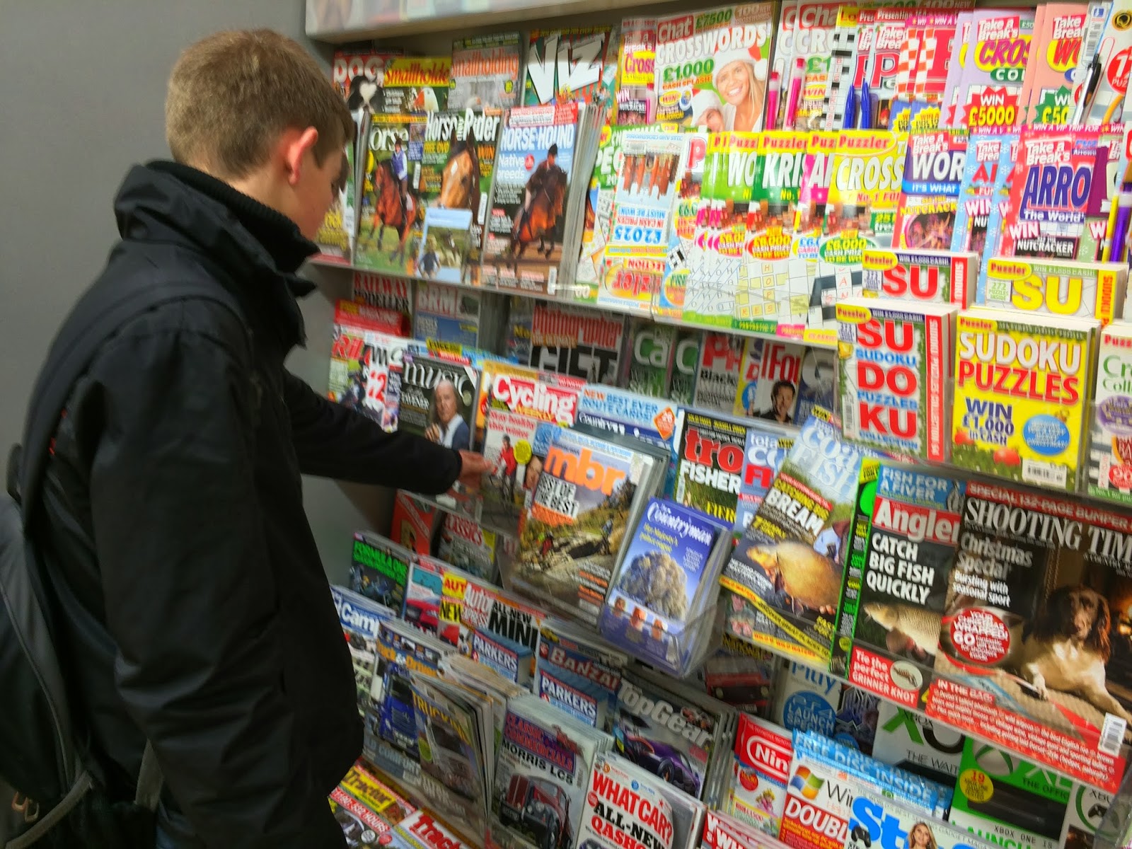
These images above show me actually researching and looking for the magazines to see which are the well designed ones and also the ones that I could possibly use for my own design of magazine and actually going to see the magazines helps a lot with the visual image of the magazine.


These images above are screenshots from my pinterest and my magazine cover board showing all the other magazine covers that I have found that i believe have a god design and might be useful when i design my own cover.

Magazine Cover Title Ideas


These are all my ideas, above, for a magazine cover title to do with sport including; adjectives, terms and all different sports. Below are all the titles that I have thought of to have on the cover of my magazine. After all the titles that I thought of my final one is; Alsport!, I chose this because I wanted a sport magazine and couldn't choose one sport so I chose a title to do with sport in general.  

Monday, 11 November 2013

John's awful business card.


Before

This design for a business card is Conflicting too much and this makes the business card very boring. This is because the fonts that have been used are too much alike which makes the design look too plain.

After


To make the business card better I got rid of the conflicting fonts and all the different alignments and replaced them with more contrasting fonts this makes the business card more appealing and interesting for the reader. I have also got rid of the three different alignments and only used one this makes the card a lot more simplistic.

Tuesday, 5 November 2013

Magazine Analysis Section 1: Magazine Covers 1 and 2


Magazine cover 1: Contrast
1.     Small and large text
2.     Different coloured backing to make the text and other backing stand out.
3.     Different coloured backings to make text stand out.
4.     A photo taken for the cover and a digital image of a tablet.
5.     Two different coloured texts in the same sentence to make some words stand out more than others.
6.     The white background and the dark images and text on the top.
7.     Big and small images but showing the same sort of product.

Magazine cover 2: Contrast
1.     Small and large text shows what text is more important to the reader.
2.     Different coloured text shows that the coloured text is something big and new for people to know about.
3.     Very large text and medium text shows that, because of the very large text, it is the most important thing on the cover and it should be the first thing people read.
4.     The different coloured backgrounds to make some things stand out from others.
5.     Large and small images but both show technology.
6.     A photo taken and a digital image added in.

7.     The little background colour and the dark images and text to make them stand out.


Magazine cover 1: Repetition
1.     The same image with a different background colour on the product.
2.     Colour on the titles for the start of a sentence.
3.     The same colour background, sometimes to show similarity.
4.     The font used all over the cover.
5.     Font colours and background colours all over the cover.

Magazine cover 2: Repetition
1.     Products made by the same company.
2.     The same size and colour text all over.
3.     The same font used all over.

4.     The same format used in that area to show neatness.


Magazine cover 1: Alignment
1.     Main titles at the top of the page left aligned.
2.     Images aligned at the top.
3.     Smaller images in the middle aligned down the left hand side.
4.     Image and text right aligned.
5.     Text left aligned to the line and aligned at the top.
6.     Text aligned to the left of the dark background.
7.     Bottom of main title and image aligned at the bottom.

Magazine cover 2: Alignment
1.     Text centrally aligned down the cover.
2.     Bottom text aligned with each at the top.
3.     Main title left aligned.
4.     Text in the top right corner left aligned.
5.     Text in the middle of the page centrally aligned.
6.     Text left aligned.

7.     Text aligned with the ‘F’ in the middle.


Magazine cover 1: Proximity
1.     Middle of the cover to the left.
2.     Middle about young people.
3.     The Google guru.
4.     Communicating.
5.     Preventing disasters.
6.     Technology speed and power.

Magazine cover 2: Proximity
1.     New phones
2.     Transferring data
3.     Avoid phishing
4.     Easy phone organisation
5.     Create killer keynote charts
6.     Save time with automator
7.     Kit rated
8.     Step up from phone cameras
9.     Bioshock infinite

1. For all your apple needs